


Stark: The new avenger everyone needed!
A neat little Figma plugin, that takes the handover to another level.
Handover is the most crucial step in the design to development handover. Zeplin is one of the prominent players in this area and Figma Dev mode is catching up. Despite the Figma Dev mode introducing the annotations, this was not enough for the accessibility data handover.
In my book Mobile Accessibility Rituals, I essentially talk about simplifying the handover process. The designers can essentially create the flows for the PWDs and create the rules for certain elements on the UI, but making sure that they get communicated to the engineering team is essential considering the growing affinity towards remote teams. You can buy a copy of the book here
Yes, I have compiled books!

Every once in a while, the content gets a bit large for blog posts. So it is assimilated and published as a book (or a notion template). You can buy the existing books and find upcoming books on this page.
I recently checked Stark, the Figma plugin in action, and I was pleasantly surprised. Stark is a Figma plugin that can be simply installed and used. You have to create a free account to use it, but the onboarding is pretty smooth. Here is the complete analysis of how it looks and what it is capable of.


Contrast

Contrast is one of the most important parts of accessibility. Stark allows you to select an element and check the elements against the contrast requirements provided in WCAG. The best part, it also supports APCA, which is better at delivering the contrast values for tricky combinations like orange and purple.

If you want to know more about why APCA is better, have a look at my other blog

Typography

Allows the designers to change the base text size and see the way the design accommodates the font scaling. This will allow the designers to spot the font scaling design breaks early in the design stage and efforts can be made to accommodate those changes.
This feature should be most useful for the design system governance teams to stress test the components.
ALT text
All image alt texts are in one place! The engineering team can just pick them up and add them to the UI. I don’t think I have to say anything more!
Touch targets
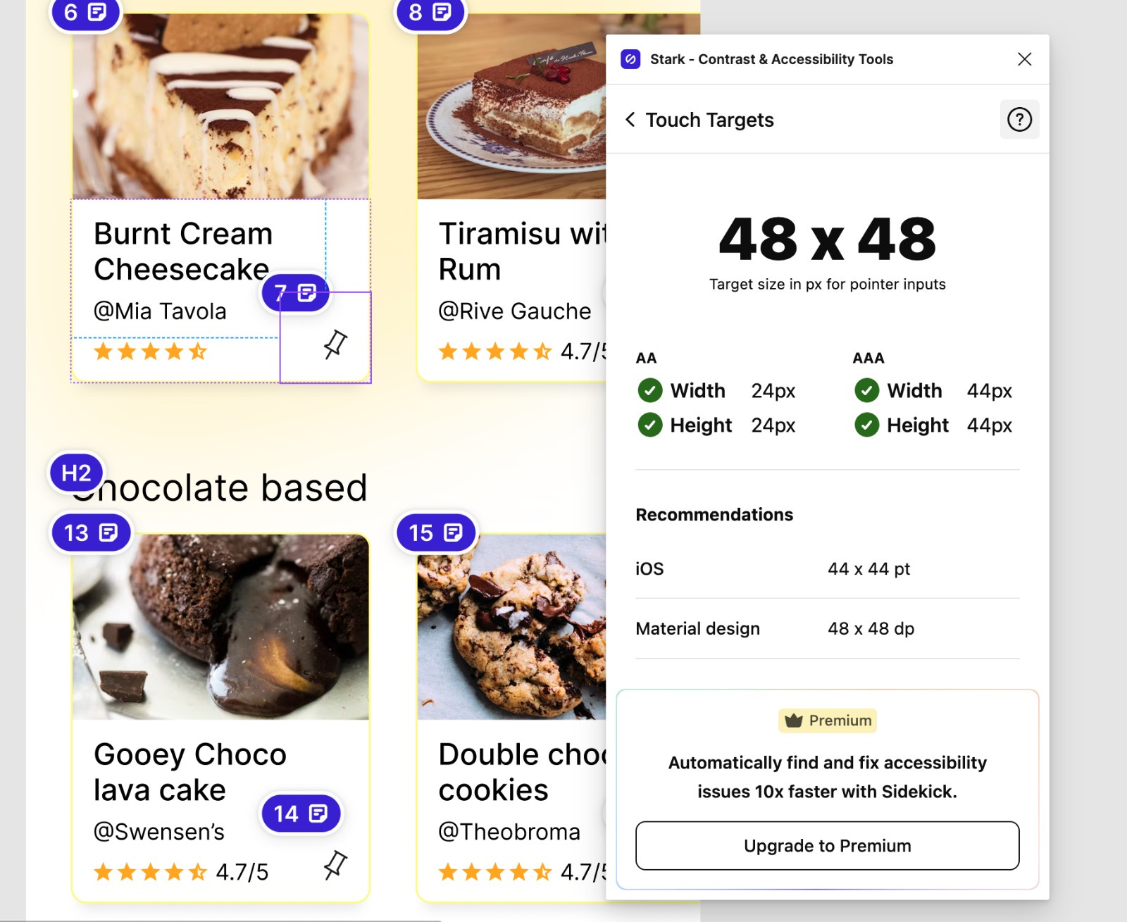
One can select an interactive component on the Figma artboard and the plugin checks if it qualifies for the minimum touch target size needed by the AA and AAA standards. It also provides the baseline from both Material design and iOS guidelines
Vision simulator

With this plugin, the designers can simulate the visual impairments for the entire screen design. The plugin can simulate all types of color blindness, Bright sunshine on the screen, blurred vision, and ghosting. The designers can run a visual check of the interfaces and correct if there are any mistakes.
One small addition I would request is the combination of color blindness and other disorders like blurring / outdoor setting etc.
Now comes the best part. This plugin not only runs checks but also provides an elegant way to handover and document the design decisions.
Focus Order
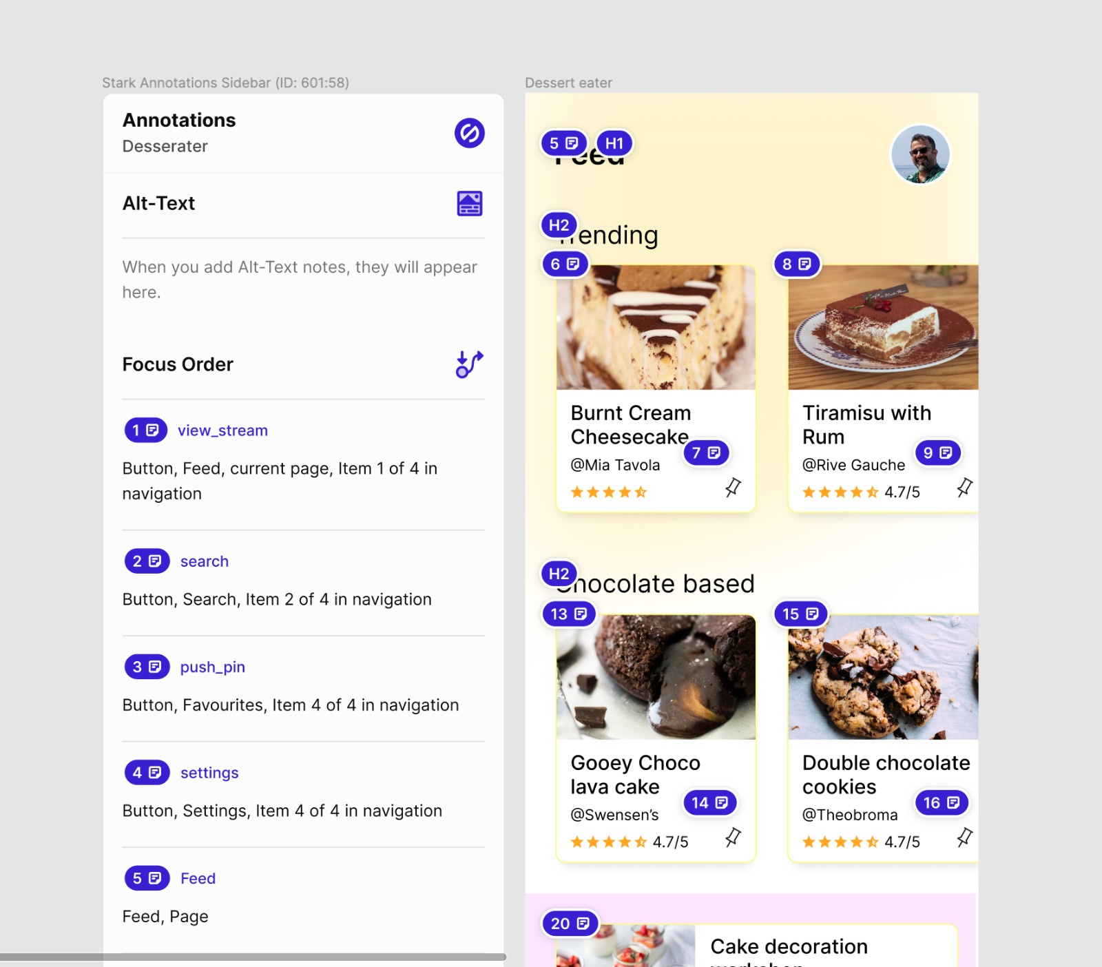
While any app is running with assistive technology like TalkBack or voiceover, the technology generally follows the left-to-right and top-to-bottom sequence. However, designers can override them by using focus orders. Stark allows the designers to create a custom focus flow, without altering the visual arrangement of the elements on the UI. The Plugin documents the focus order and the accessibility labels for the most effective handover.
A few suggestions to improve the ease of use would be
The reordering of focus order cards could have been a drag-and-drop
The focus order cards can also document the destinations for swipe-up and swipe-down gestures. This can be used to jump from one list to another.
Headings
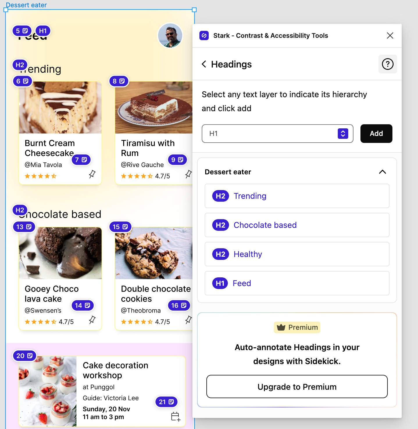
Headings allow the users using assistive technology to skip to the next heading. On mobile apps, this could be handled with lists and list headings. The plugin allows the designers to document the headings which allows the screen readers to understand the way page is structured in terms of sections. This would pair very nicely with the above request of allowing documentation of the swipe-up and swipe-down targets.
Notes
General handover notes for the developers. However, for the Web, one can provide ARIA labels, while for mobile one can add specific labels for Talkback and voiceover. So the same file can be used to hand over the data to all the engineering teams.
Conclusion
Stark can do for mobile apps, what Include has been doing for the web. I believe this is one of the great solutions to enhance the handover of the accessibility data to the engineering teams. As for the designers who need to fill in all this data, they can do it with less effort and in a more structured format.
Also, there is always the book, Mobile Accessibility Rituals, linked at the beginning of this post that can guide them to effectively label everything. and like I always say, when it comes to accessibility, Done is always better than Perfect!