
Vibe coding and design systems
the problems with vibecoding and rise of VibeMagic

The rise of vibe coding
When V0 released their first version for public use, everybody jumped on it. It was capable of generating front and code with AI. This was advertised as something designers can use to build out the websites or web apps of their dreams without depending on any engineering team. Everyone was fascinated with the gradient buttons, subtle glows and the quickness with which the concepts started taking shape. Earlier designer had to rely on Figma prototypes to convey their ideas. Figma prototypes were efficient, and less cost intensive the developing the entire front end, just to get the customer feedback. However, these prototypes did have their limitations when it came to automated responsiveness, interactive input fields, and manipulating the results based on real time filters. As application started becoming complex, these prototypes were definitely not enough to capture the real user feedback.
The term Vibe coding was introduced somewhere in 2024, as the means of creating better prototypes, faster, with AI, to capture the real feedback for complicated applications. But this is where the problems began. Traditionally, the Sigma prototypes in a company were built using design systems. These design systems were the single source of truth, built for human interpretation. Designers would search the design system components to build the user interface. They will then hand over the tested interfaces to the development team. The development team will referred to the same design system to get the pre created code for the components used in the UI. This system is efficient when all the parties involved are humans.
With the rise of Vibe coding, designers started taking charge of creating a functional UI. This was beneficial for two reasons. One , it took the prototypes closer to bought the end product would be. And second, the logic was built in the front end, which the development team could refractor and use. Despite the benefits, there was a major flaw that existed in this system. The vibe coding tools, did not play well with the established design systems… and why would they? These systems were built for humans to interpret and refer to, and not built for the AI agents to siphon code from. This created a gap, where designers were creating function prototypes, but not aligned with the design system. The development team had to do extra work to remove the non compliant components and replace them with the proper ones from the design systems.
Current state of Design
Fast forward to 2026. The expectations from designers have increased a lot. The designers are now just pixel pushers, but are expected to deliver front end code. With the speed enhancements offered by AI, the designers are now handling research, ideations, design process, polishing, front end coding and testing. However, the AI coding tools still refuse to play well with the establish design systems. In the absence of a proper prompt, the AI agent will always default to purple or gradient buttons, elevated card layouts, and Inter everywhere!
The problem persists because of two main reasons. First is the default css added for the easy operation of the AI agent. The second reason, the context window. Without getting technical, the AI agent forgets the component customizations you asked it to do about 20 messages ago. This means, that despite you asking the agent to follow a certain styling guidelines, the agent will start forgetting it when the application starts getting complex. Once agent starts ‘forgetting’ it will start going back to the default styling - purple buttons and inter!
As a designer, I had been struggling with the same problem. And then a during a casual conversation with a w-AI-se (see what I did there?) man called Shivam Johri about system instructions, a new idea was born!
The idea was remarkably simple. Instead of forcing the design system to adopt we can convert the design systems into instructions. Instead of sending the data for each component as code, we can describe the components, like dimensions, colours, text styles, shadows, paddings, layouts and other applicable visual properties. A compilation of allt hese instructions can go inside an extremely lightweight markdown file, which can sit inside your project folder. All you have to do is to ask the AI agent to refer to the instructions whole creating the UI. This file can also include instructions about layout, like how the navigation is structured as a reusable pattern, how the tables are built, how the overlays should be structured. This file can also handle the base tokens like colour codes and typography. Overall this becomes the design system, described in simple English. So when the user sends an instruction that add a secondary button with text “start over” in the top scaffolding bar of results page, the agent already know which page, what scaffolding is, where the button will be placed, what a secondary button is, how it looks in terms of colours, dimensions and padding, what are the hover interactions, how the focus state would appear and what the text on the button is going to be. Ultimately, this becomes a constant reminder for the agent to follow the design guidelines. This will save the designers a lot of micro-frustrations and probably a few tokens.
Building this instructions file is a huge task. As a designer working on multiple projects, I had to create multiple instruction files to make sure that all the front end development followed the project design system, so it was time to convert that into a tool. This is how Vibemagic was born.
And now, Magic!
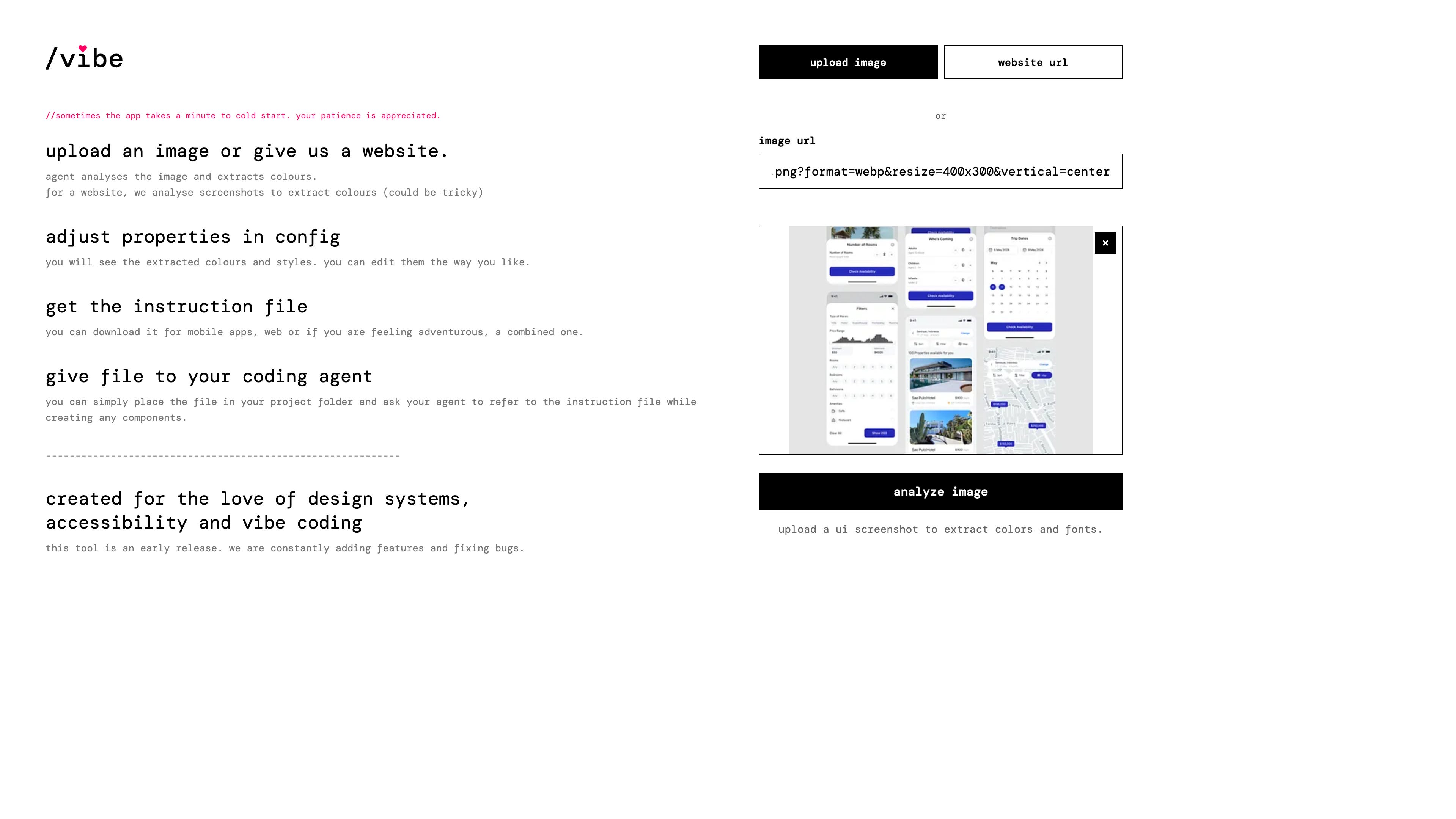
Vibemagic.in is a instruction building tool, which helps you convert your design system into an instruction file. To help you out, the tool allows you to start with an image or website URL. an AI agent, (I built that guy - all hail Claude Code!) would analyze the image or a screenshot of the website to extract closest matching colours and styles.
Then the config screen opens up, which is where the magic happens. Most of the styles will be auto detected and applied. The config UI gets populated with detected colours and typography. Although typography is limited to a few popular few, a custom font name can be added. This will be added to the instruction file as is for the vibe coding platform to embed that. Similarly, icon library can also be be chosen from the most popular icon packs backpacks globally used for development purposes unlike fonts these icon packs can be seen reflecting onto the icon buttons immediately.
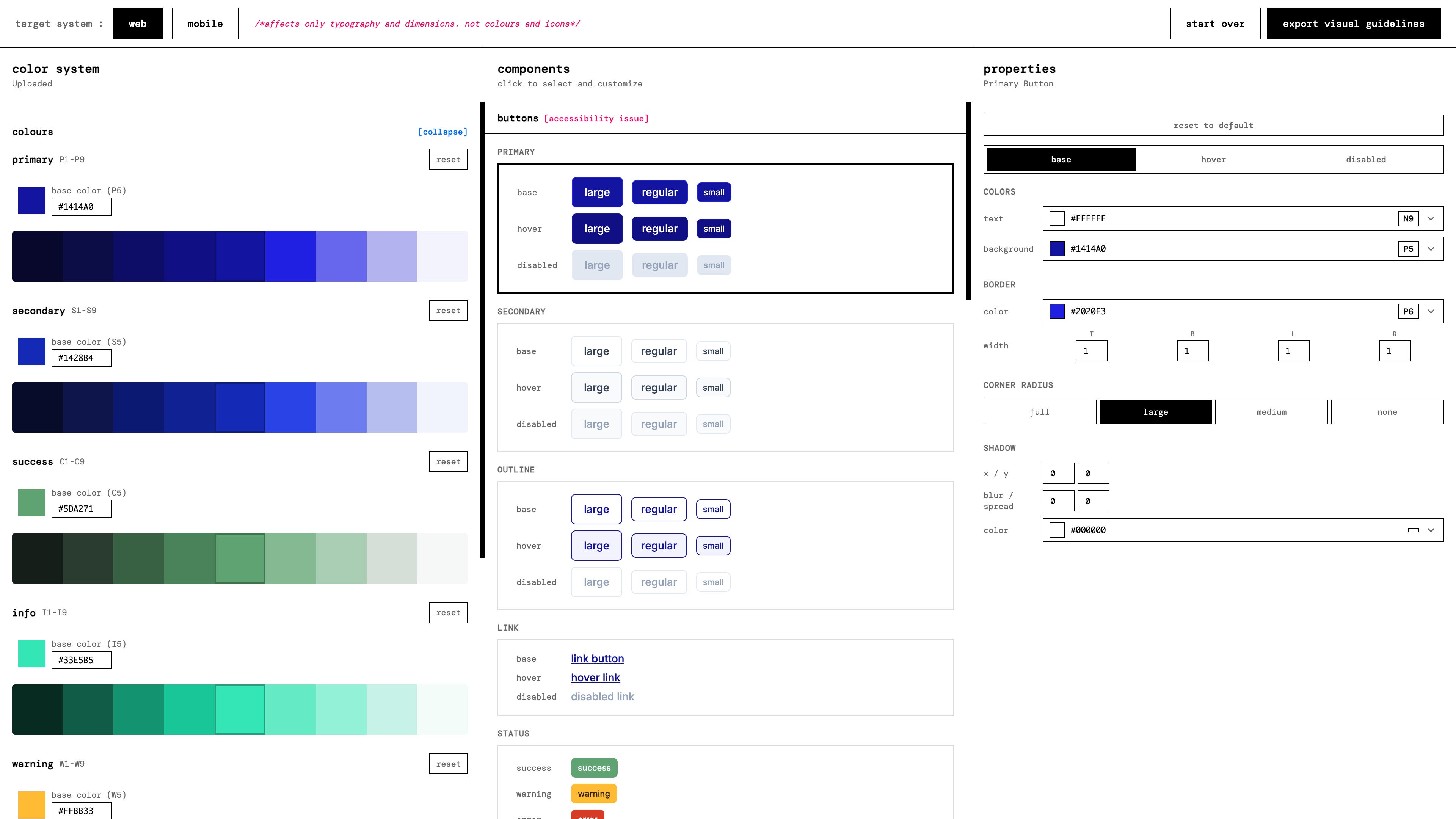
A designer visiting this space can start manipulating the properties of specific components to match them with the design systems they are currently working with. In the background the agent will keep observing the colors used for borders and backgrounds the corner radii as well as the shadow manipulation for the base state, the hover state and the disable states and it will keep generating the instructions for your future wipe coding platform. The tool currently covers buttons, links, status icons sorry status pills, icon buttons, text input drop downs check boxes radio buttons toggles sliders and cards as as the starting elements for the instruction file.
The tool supports creation of instruction files for both web and mobile. It is recommended to use either web or mobile because very few projects will combine the elements of both web and mobile interfaces the fundamental difference between the web and the mobile is the presence of whole components the presence of whole and smaller components in the web and the dimensions in which the element specifications have been added into the instructions. Web uses pixel whereas mobile uses DP or point depending upon whether an iOS or Android app will be generated using this.
And also Accessibility!
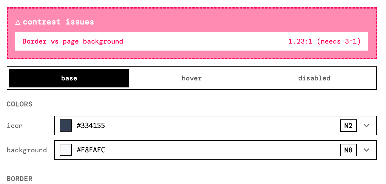
How can I build a tool that does not consider accessibility at all? Every single time this particular tool detects that there is not enough contrast between text the button background or the button border and the background it will highlight that immediately with an attention seeking bright pink color. When the values of the colors are manipulated from the given tokens and if the contrast requirements are satisfied the accessibility error will go away. Below is the screenshot of one such accessibility error where the border does not have enough contrast with the page background.
The tool doesn't stop just at the visual aspects, but also taps into to the name - role - value -state accessibility tags to ensure that the The vibe coding platform includes the accessibility tags into the front-end code by default.
We generated one… now what
As a designer, I have been wasting a lot of tokens into fixing the components whenever I add a new page or a new feature. With this instruction file in place, what I have observed is no matter what format you provide the design in your white coding platform will always draw the components in a specific way as described in the instruction file. I have even tried it with dirty sketches exported from Excalidraw and it still worked.
The way you use this file is pretty simple. All you have to do is paste this file into the project folder doesn’t matter where and then whenever you are trying to create a new page or a new feature or a new overlay Instruct your vibe coding platform to refer to the guideline file on instructions about drawing the components.
So give it a try. I am constantly seeking feedback and improving the tool.
TIA.